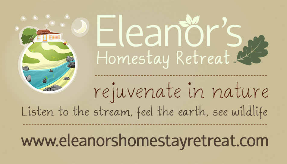
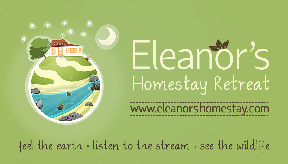
Eleanors Homestay Logo
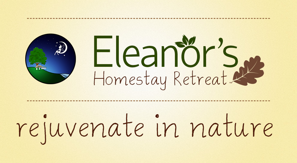
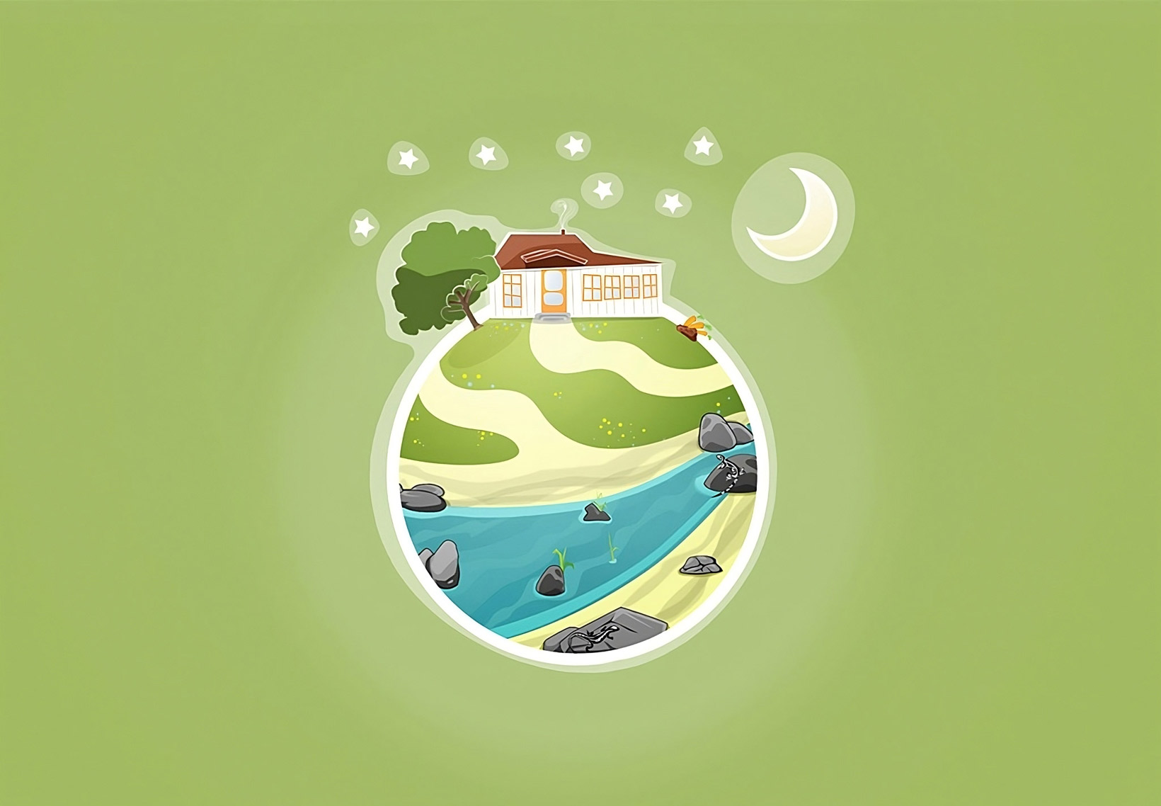
Eleanor had commissioned me to create a new logo for her business for vacation home rentals. The house was located in rural area of California with a beautiful stream running around the perimeter of the property. When you’re at the property it really feels like you are in your own private bubble in nature. For the logo I wanted to capture the essence of the surrounding nature but also highlight the house as a historic building with a story that unfolds as you explore the lands. I included a nice depiction of the stars and moon to demonstrate that there is a fantastic view at night as there is no light pollution at the properties location.
I really enjoyed spending my time creating this logo; I think I conveyed the natural energy, color and peacefulness of the vacation property without it being too over-bearing with details. I took this approach so that the logo would still be clear when scaled down to a business card size.
1. Quick Sketch
I started off with general flow and composition of the logo. I wanted to create the design in a bubble form to give the feeling of seeing the vacation property as a world of nature. On the property there is an iconic large oak tree, in the beginning of this logo design I made the tree a main feature of the logo design. I brought in sunlight and featured a creek that runs through the perimeter of the property. I started with a design of a tree leaf which then developed into the shape of the water.
2. Day to Night
Throughout the development of this logo I sent over regular new drafts to Eleanor for evaluation. At this point she made the suggestion of trying out a night scene instead with a moon.
3. Coloring
Eleanor couldn’t determine what the leaves were being whisked by the wind from the tree and thought the tree needed to be colored, we also decided that the fairy wasn’t such a good idea.
4. Sketching the House
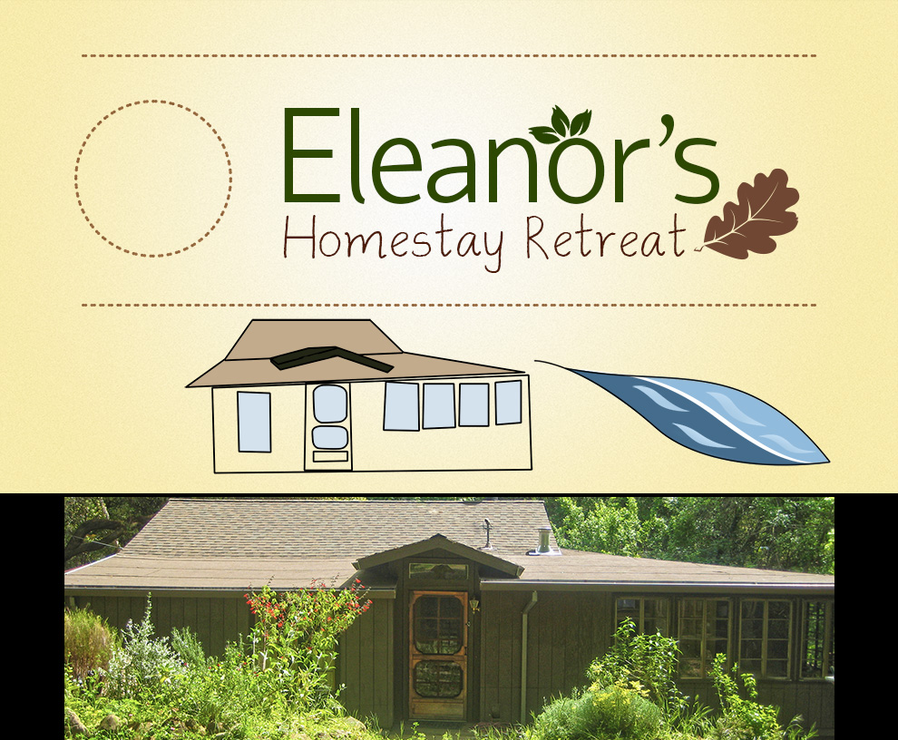
I sketched out a rough stencil of the house and started to play around with the composition with the different elements of the logo. As I was getting closer to my vision of creating a world I decided it would be a good idea to step back from the design, scale everything down and think about the branding of the business. I began working text in with the design; continuing with the nature theme I drew a couple of different leaf designs. To being a more homely feel to the design I picked a handwritten style for the title below the word Eleanor.
5. Business Card
I experimented with what the design might look like as a business card so that I can see how the logo might work at different scales.
6. House Drawing and Circle Inversion
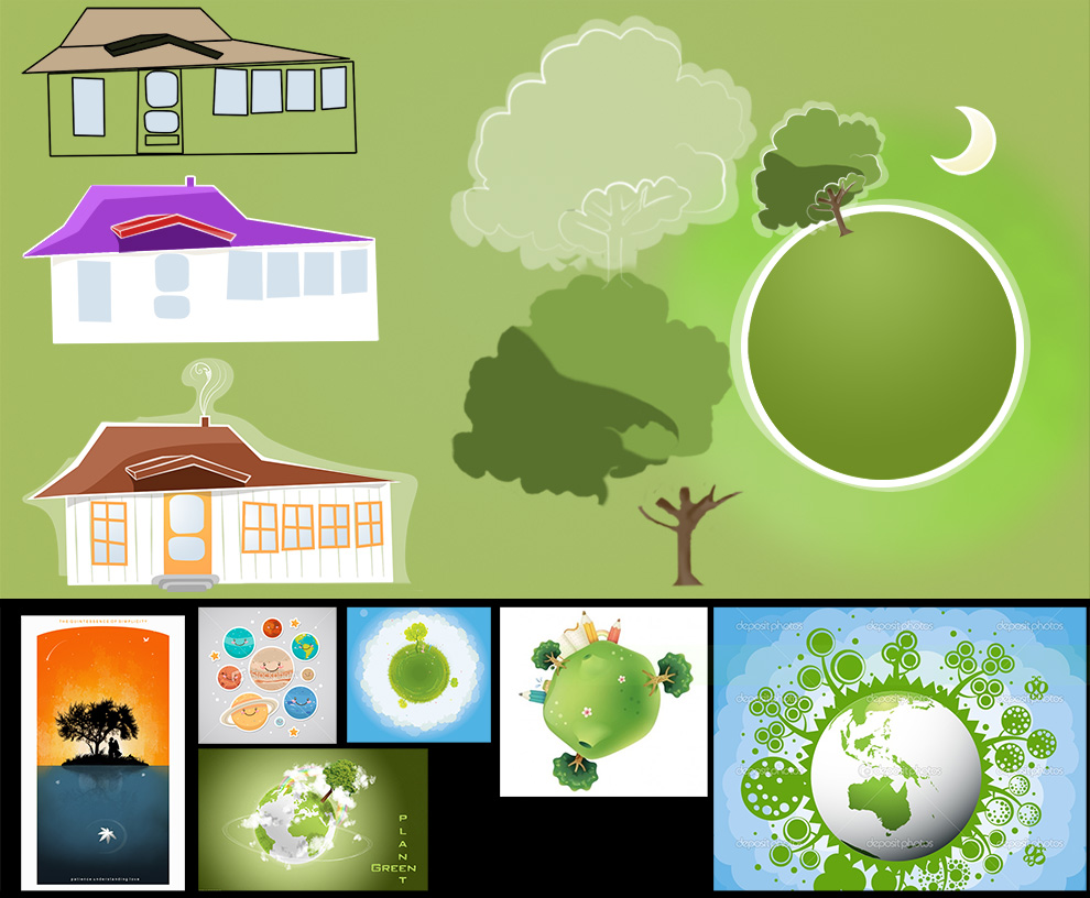
At this point I refined my design for the vacation rental house and large oak tree on the property. I wasn’t quite satisfied with the current direction that my design was going in so I decided to experiment more with the composition of the design. I liked my original circle idea, but wanted to give it more depth. I began with finding similar designs online that were similar to my current design. I did a quick Google for vector planet, and made a montage of images that I liked. You can see these images below the canvas I was working here.
7. Flowing Creek
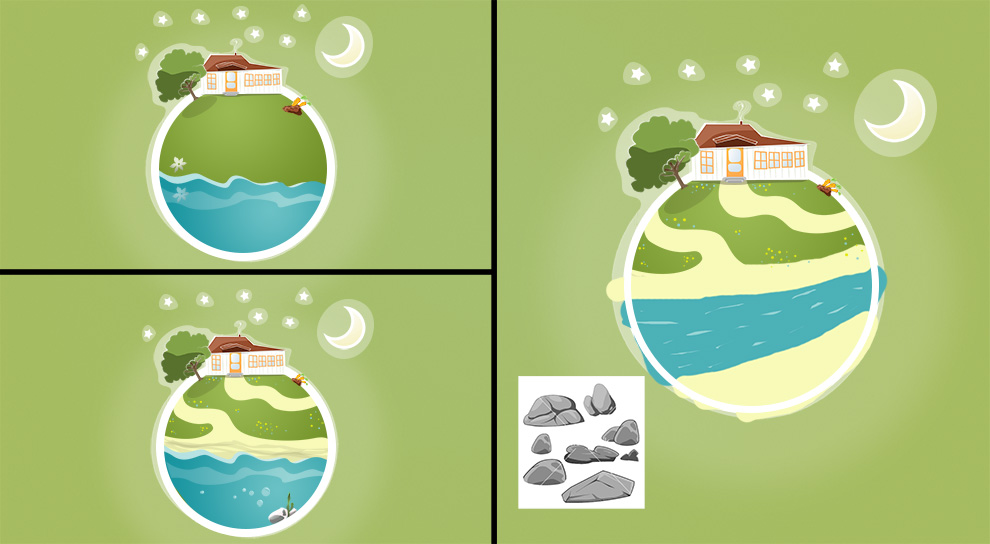
I created an interesting composition of merging perspectives; to highlight the house and oak tree on top of the globe and I weaved the path leading from the house around the globe and down towards the running creek which is kept within the boundaries of the circular globe design.
It took me a couple of iterations until I was satisfied with capturing the flow of the creek. I wasn’t keen on my initial water design as it looked more like an ocean. I spent about an hour painting over the design to figure out a good flow to the water; eventually I ended up with the image on the right. Also the stars are in the constellation arrangement of the Big Dipper as it is a iconic and easy to distinguish pattern that worked well to complement the composition of the sphere below, without creating too much contrast in detail. I also added some carrots to the top right of the sphere to show that food is also grown on the property.
8. Detailing
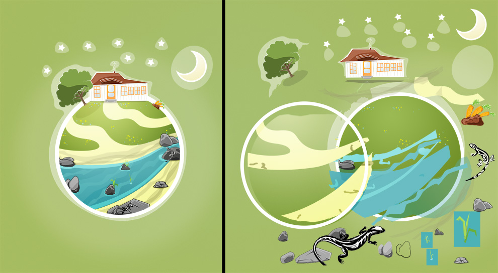
From here I added and took away details as the design took shape. On the right I’ve broken down all the individual elements to the logo which includes; geckos, rocks, reeds, multiple water layers, stars & moon with glowing wavy outlines.
9. Business Card Structure
At this point I put together another business card design with all the elements that Eleanor asked me to include into the design. I could see it getting closer to looking like a completed design that I was happy with.
10. Finished Design – Business Card & Logo
After playing around with different color, text and layout options I finally settled on the final design and composition which I think gets across all the information required and captures the beauty of the nature surrounding the vacation rental property with a very clear yet specifically detailed design.

