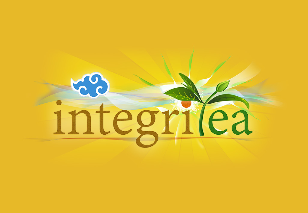
IntegriTea Logo
I was commissioned me to create a new logo for my clients new tea store. I started out by sketching my rough idea on paper first, I researched a few different images of tea leaves and worked the plant into the typography. I wanted to represent the earth, plants, sky and sun in this logo. I used a 4 color pallet for this design of complimentary colors; orange, brown, green and blue. I grounded the text with a slight earthy-dirt look and rounded out the composition with a very colorful blue cloud. To maximize brightness I drew large sun beams stretching across the background to increase the focal point of the design the full length of the text.
I really enjoyed spending my time creating this logo; I think I conveyed the natural energy, color and peacefulness of different tea varieties. I was mindful to make the design very visible when scaled down to a business card size – so that the text is very distinct and legible.

